
BACKGROUND: Conduct multi-stage interviews with a partner in order to come up with an ideal calendar app. Created multiple personas to further cater the app to a broader audience. Design a calendar app from the ground up with user-flows, wire frame structures and a final prototype.
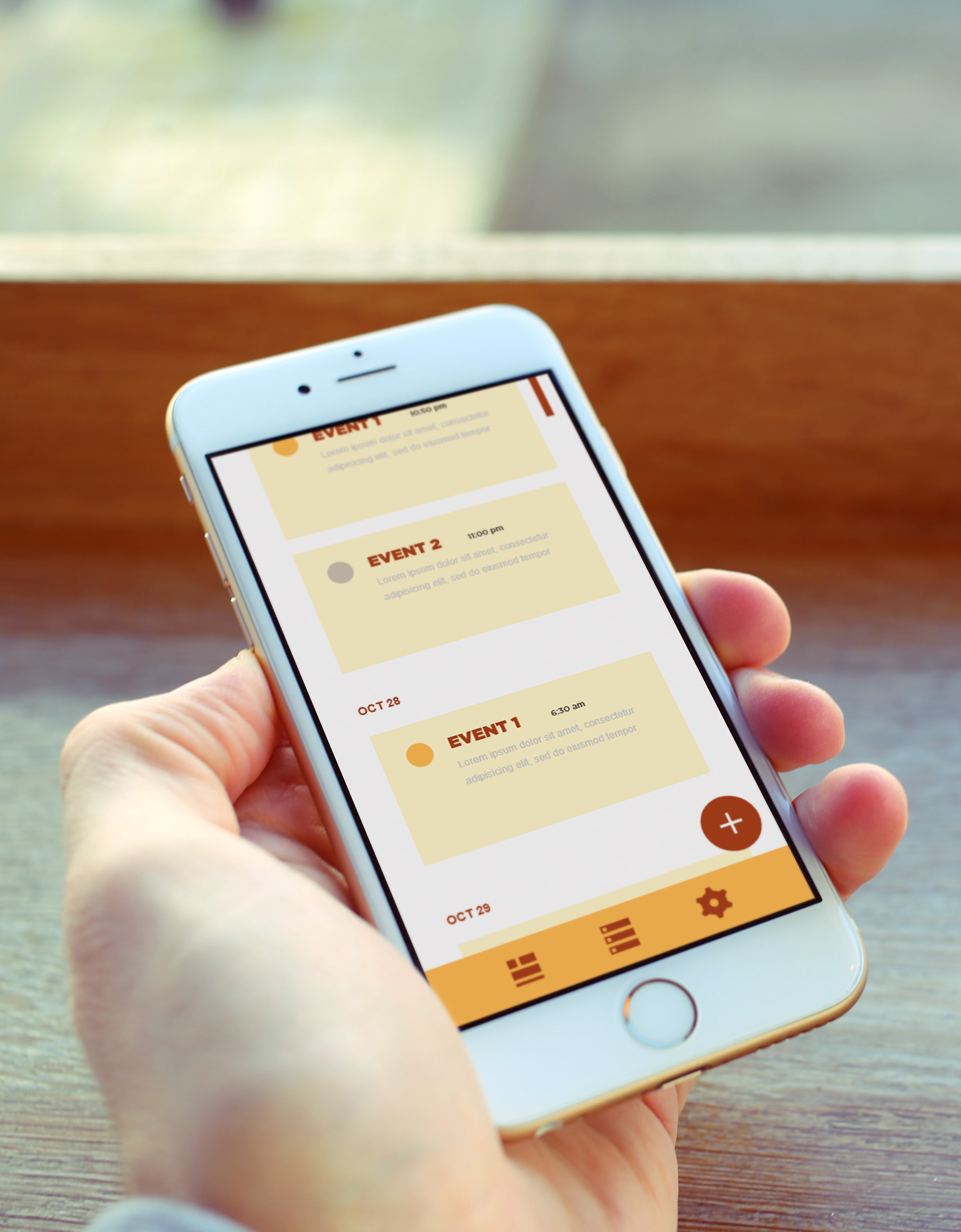
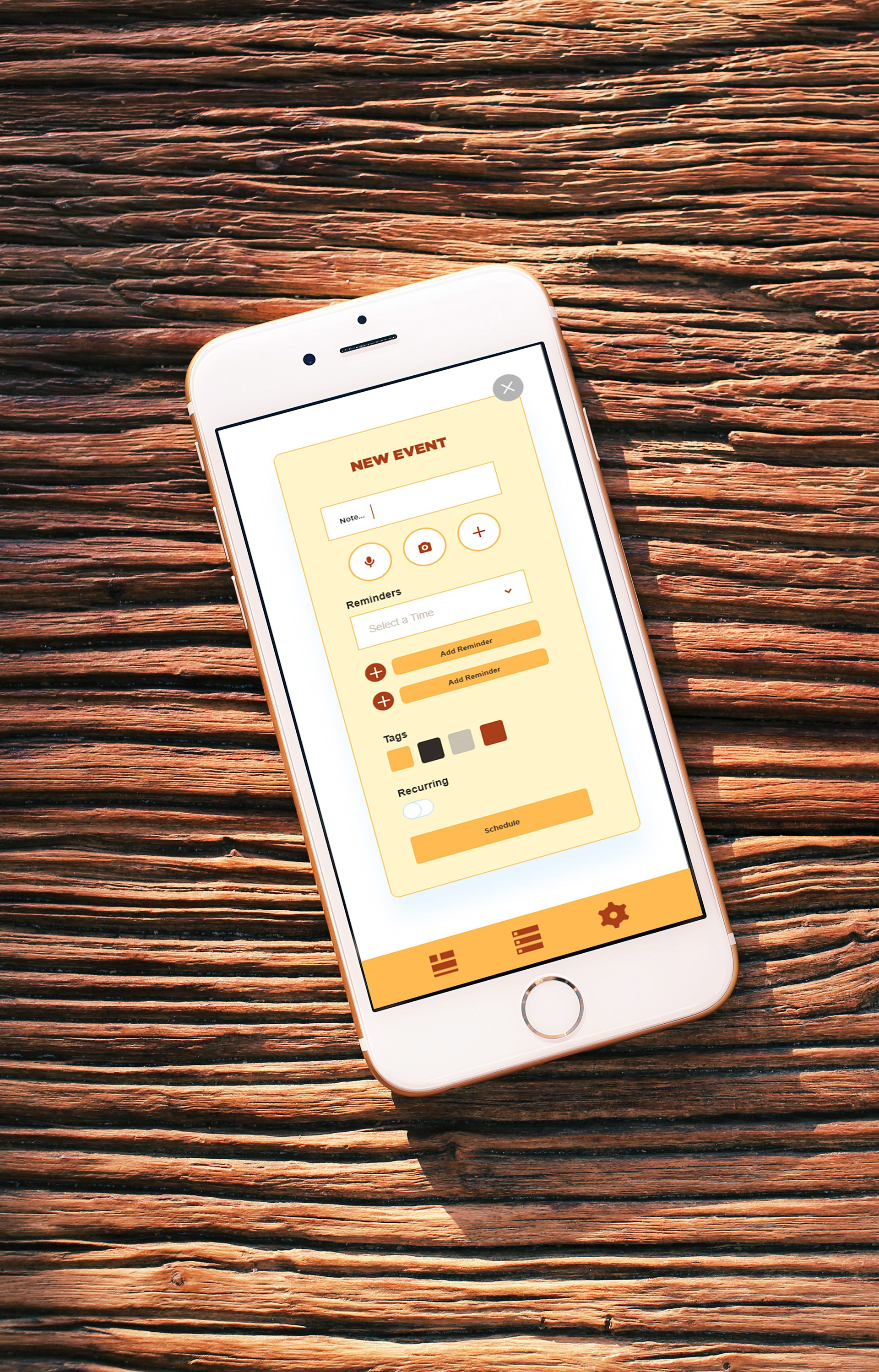
CONCEPT: Nudge is a new calendar app with a focus on simplicity, ease of use, and multi-choice functionality.
PROBLEM STATEMENT: A user needs a way to see their week from a birds-eye view, and have multiple ways to fill out their calendar besides by typing. They feels like having to type everything by hand makes them lazy and not want to fill it out that way they make sure they stay organized and on top of their daily tasks.
INTERVIEW: After conducting a series of interviews, it was postulated that the user of this app would want an app that was easy to use, simple and bare bones, so that the graphical elements do not make viewing the calendar more difficult to do. The user requested an app that provides multiple notifications for a task in that it alerts them of when to do an assignment, and when the assignment is due.
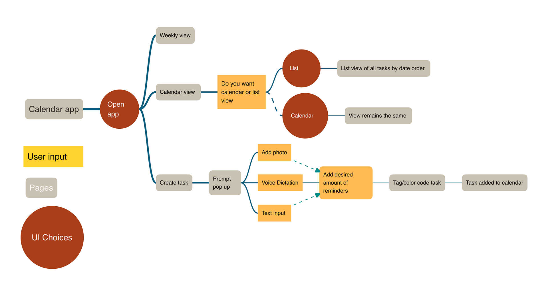
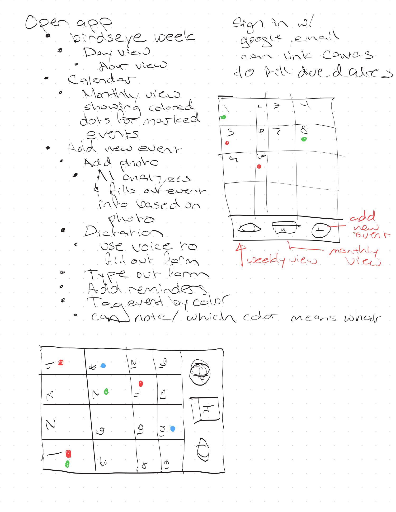
USER FLOW: A user flow chart was created to plan out the app's user choices, input boxes, and the different calendar pages.
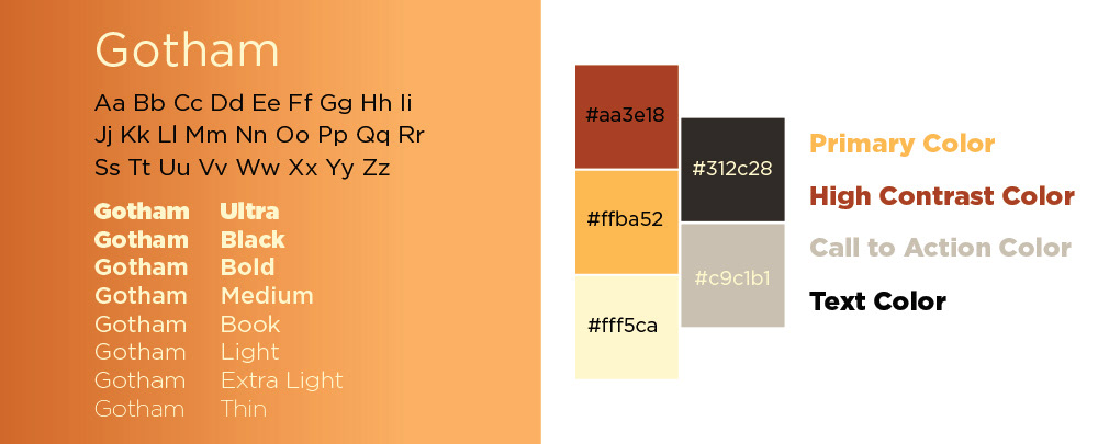
TYPOGRAPHY AND COLOR PALETTE: User stated that they were tired of seeing every calendar they use have a cooler color palette scheme to it. We took this into consideration and created a color palette that was full of warm colors which also limits the blue-light exposure to the user as well.
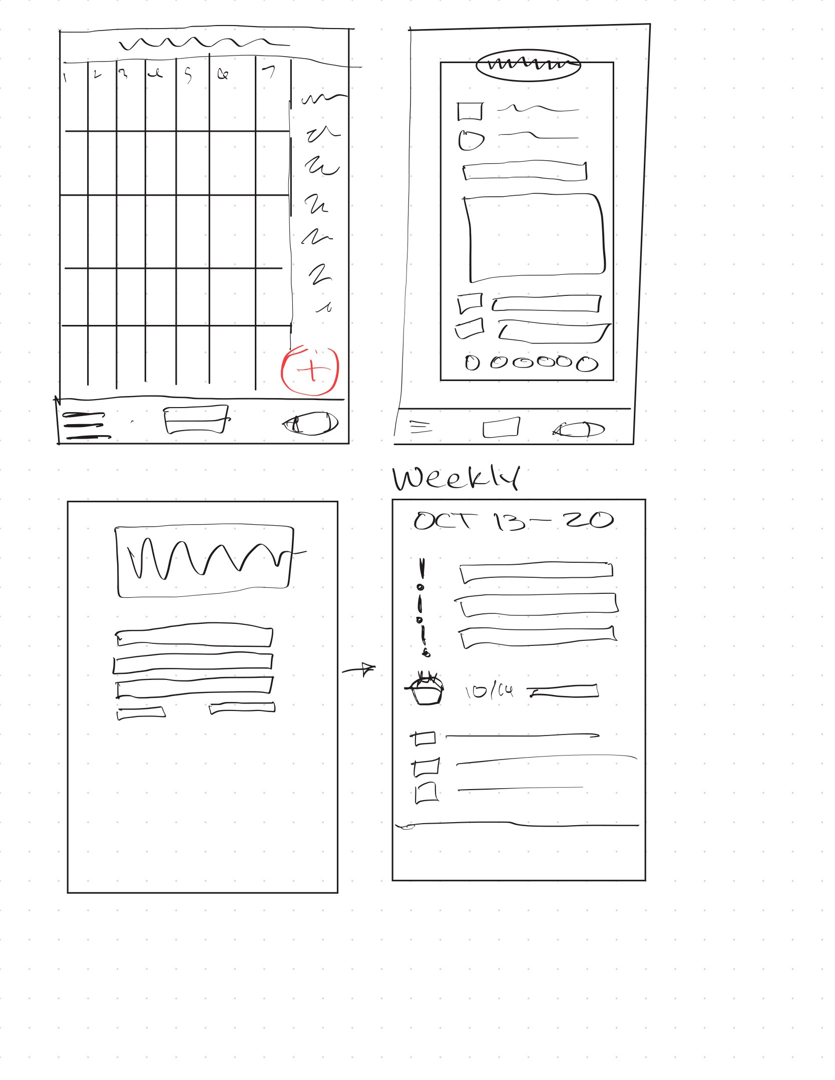
WIRE FRAME SKETCHES:
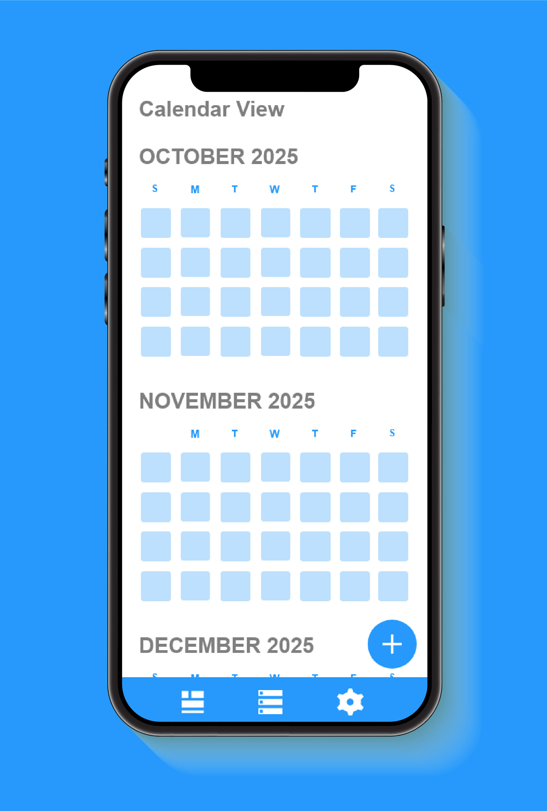
HIGH FIDELITY WIRE FRAME:
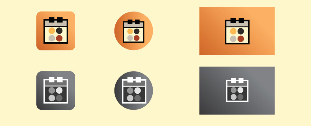
APP ICONS:
FINAL LOOK:
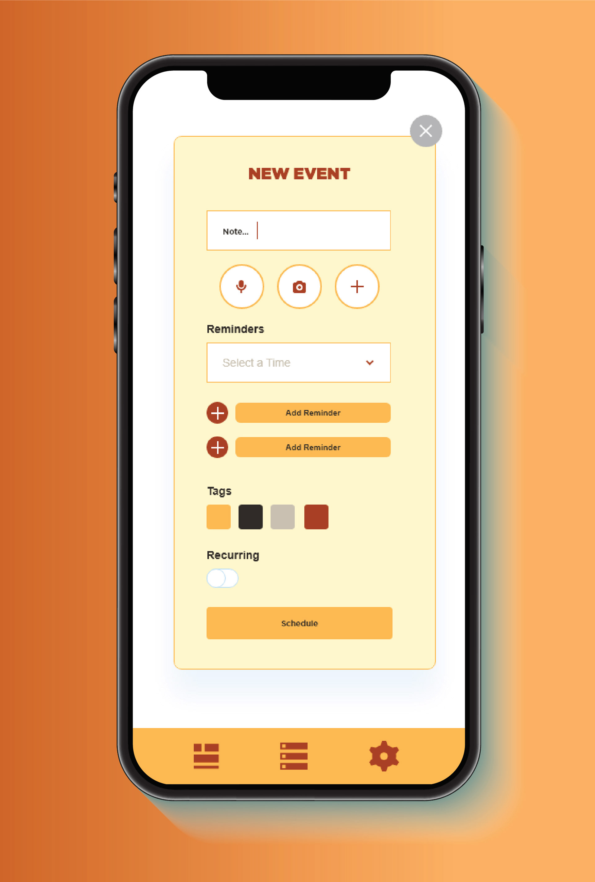
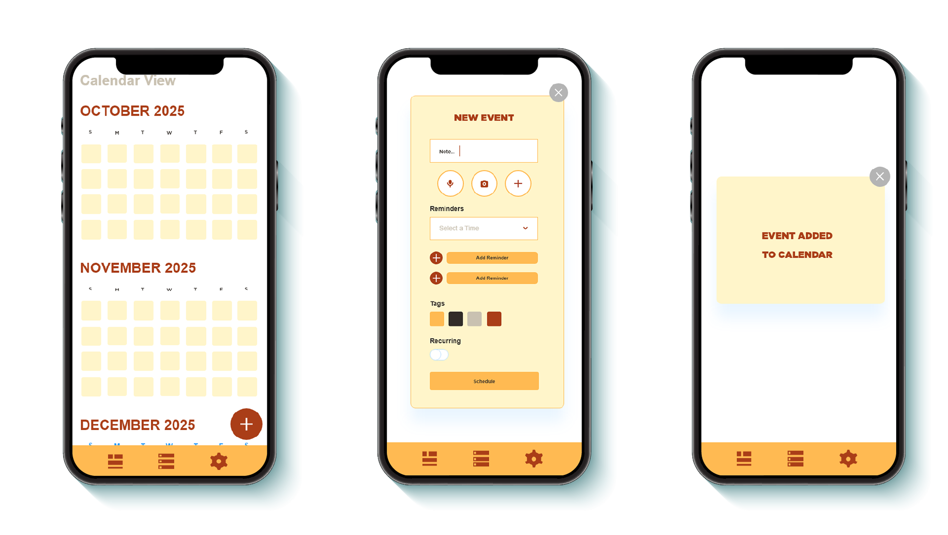
Shown here is the calendar view along with the new event prompt and the confirmation box that appears after you create a new task.
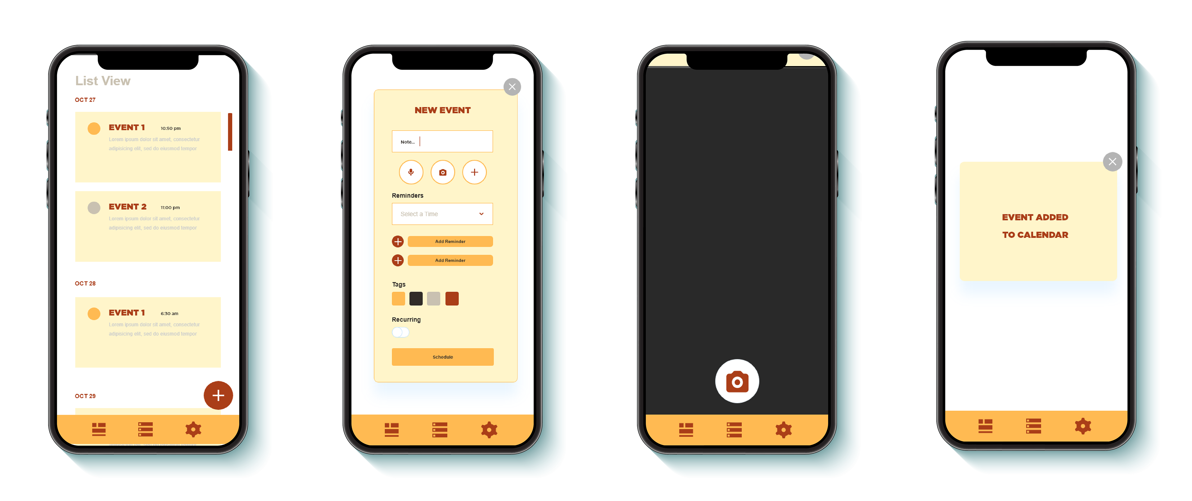
Featured here is the apps ability to be able to add a photo instead of having to write out your task in text format.