CLIENT: Non-Profit Organization
BACKGROUND: A non-profit organization that helps kids with life-threatening illnesses and their families is hosting their annual 5K+ walk to raise funds for their organization.
CONCEPT: The following is a concept of the design of all of the print media, t-shirts, social media campaigns, and medals for the organization's event. The color scheme reflects the charity's color palette of blues and cyan colors while adding additional secondary colors to accent the blues.

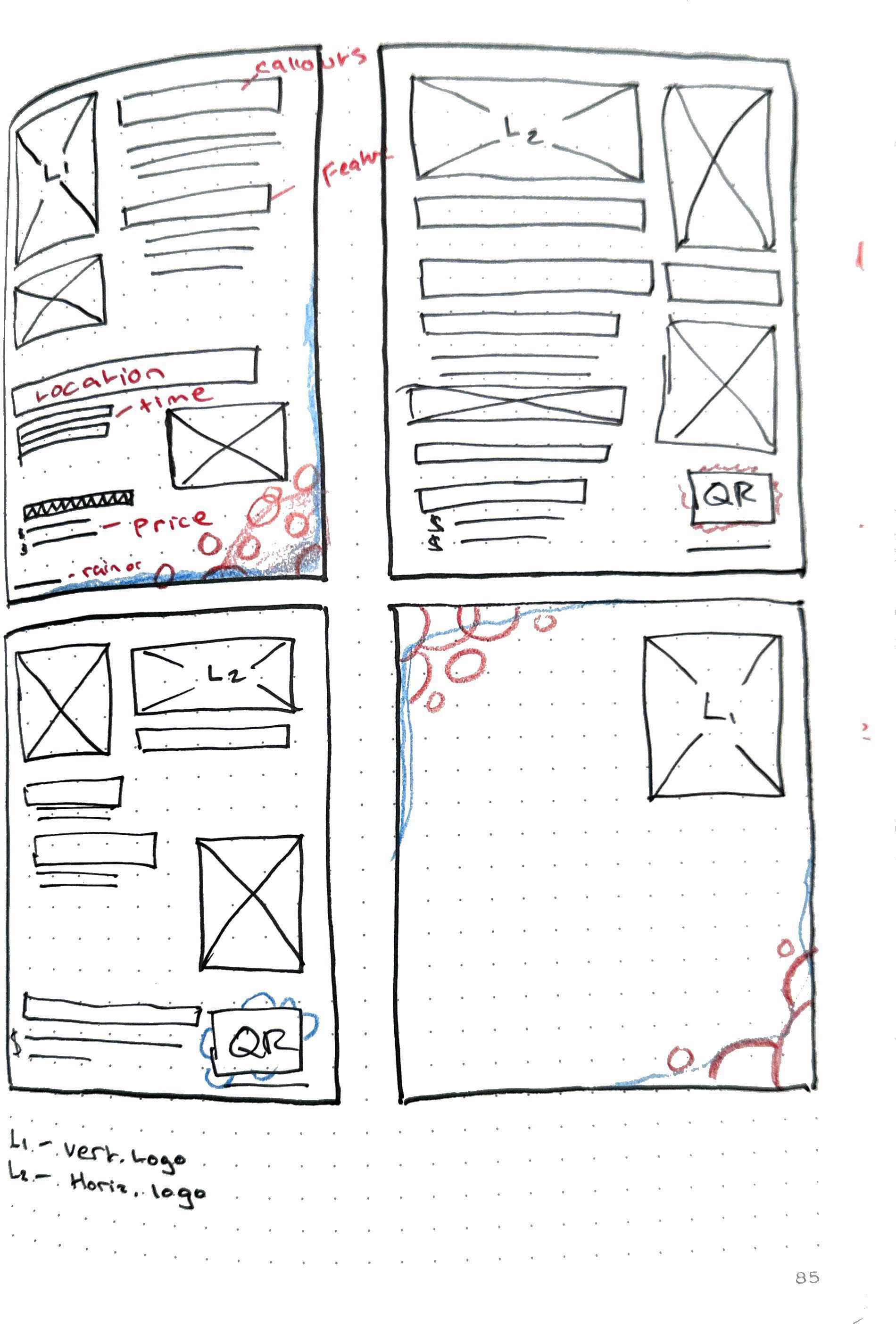
Initial layout sketches
Setting up copy
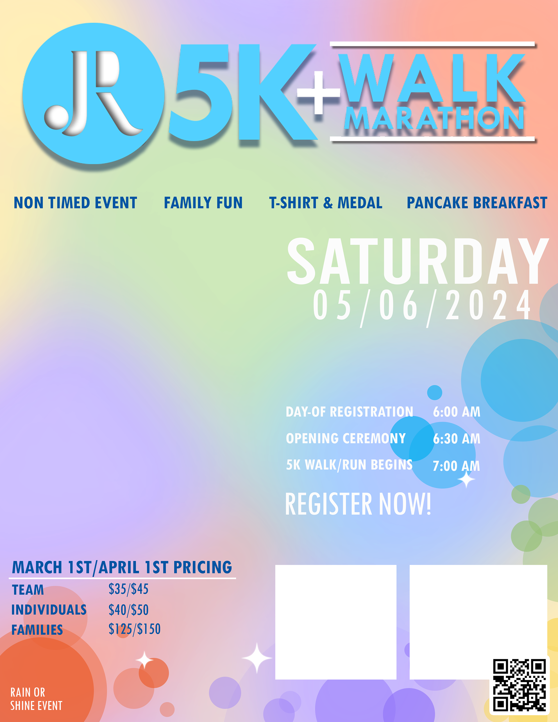
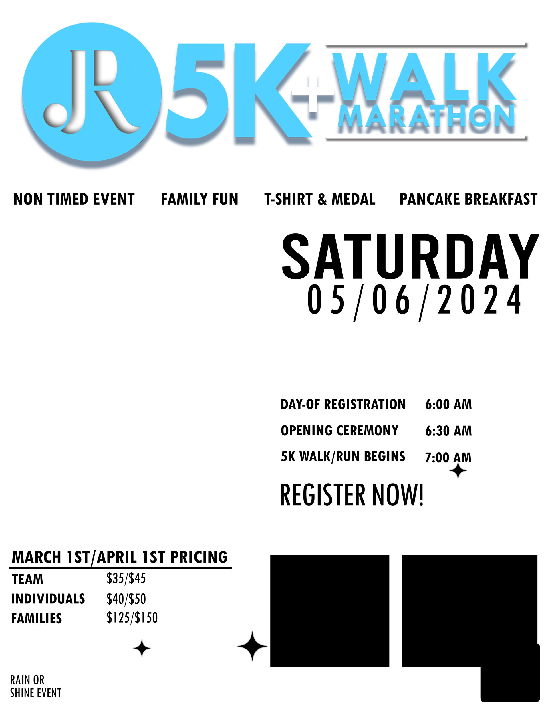
Experimenting with different background designs
FLYER CREATION: The process for creating the main flyer for the event began on paper with the sketching of the layout. Then with the copy in hand, I laid it all out to get my sizing and hierarchy down. I experimented a bit with different looks for the poster graphics. Ultimately I went with a more geometric look with triangles and a colorful color palette that the foundation was already using for their branding. The typeface was also one that the foundation uses extensively in all of their print and digital media. Below are the different sketches and the final version of the event poster.
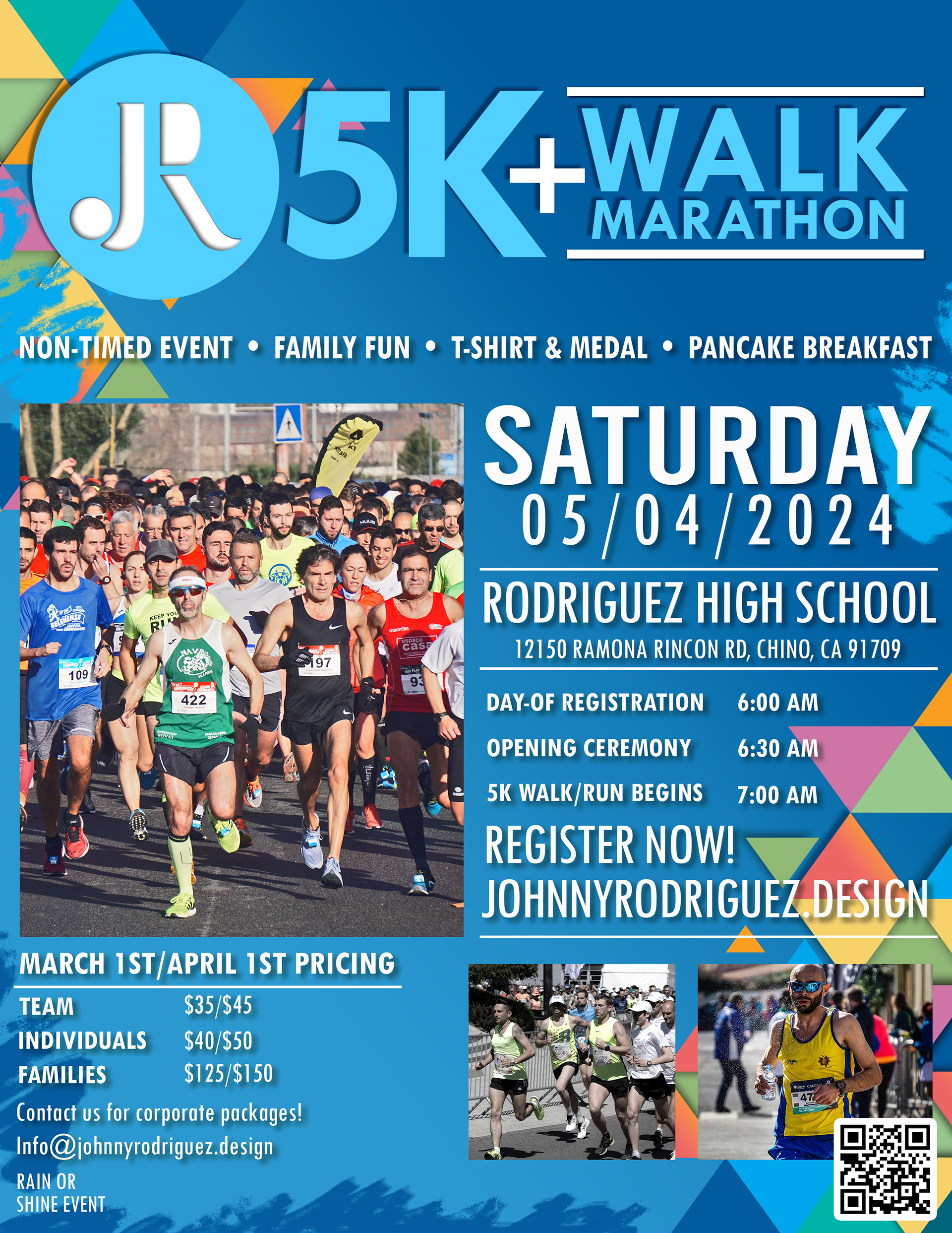
Final version of the event flyer
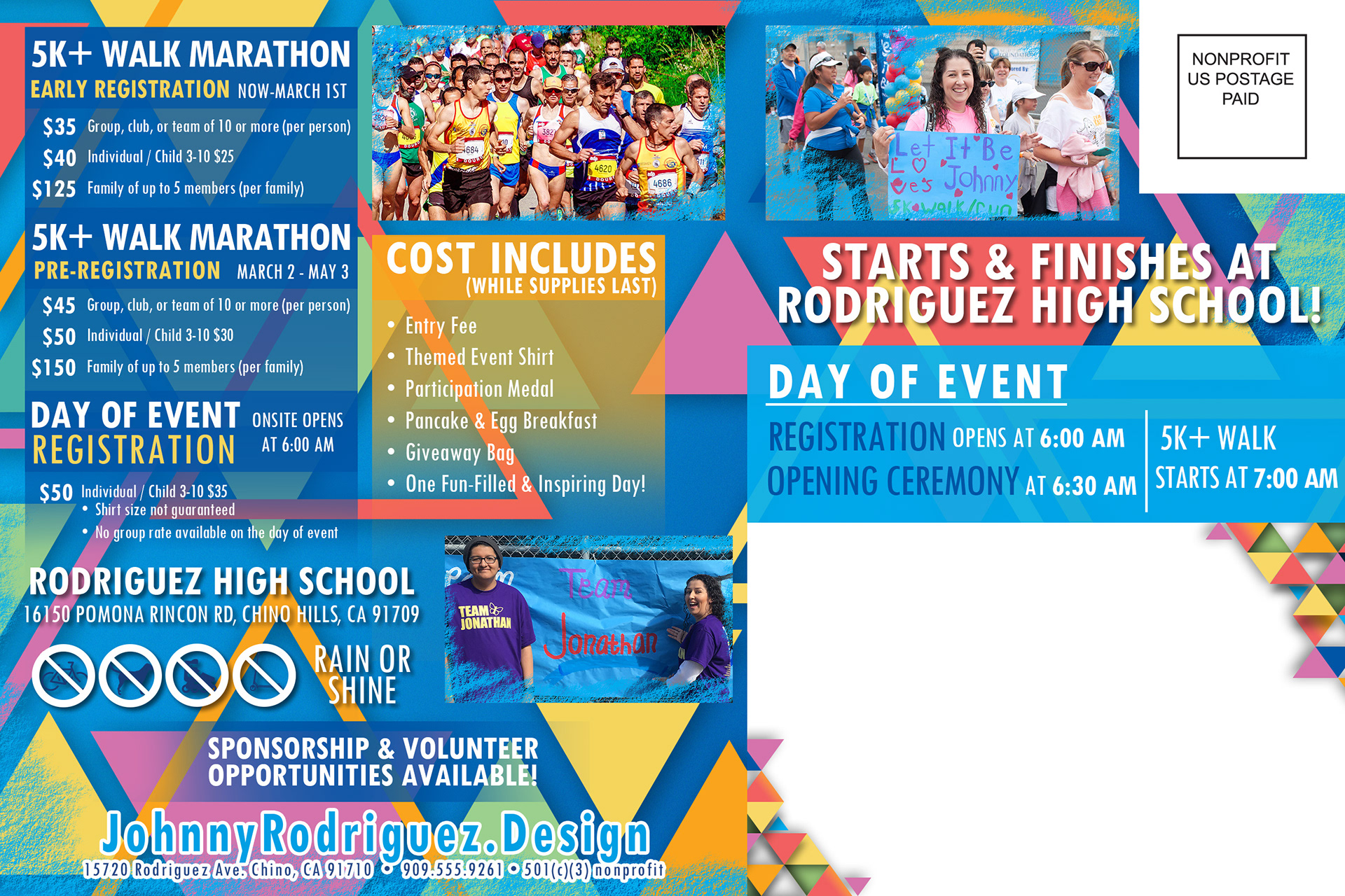
A postcard mailer to send out to prospective attendees
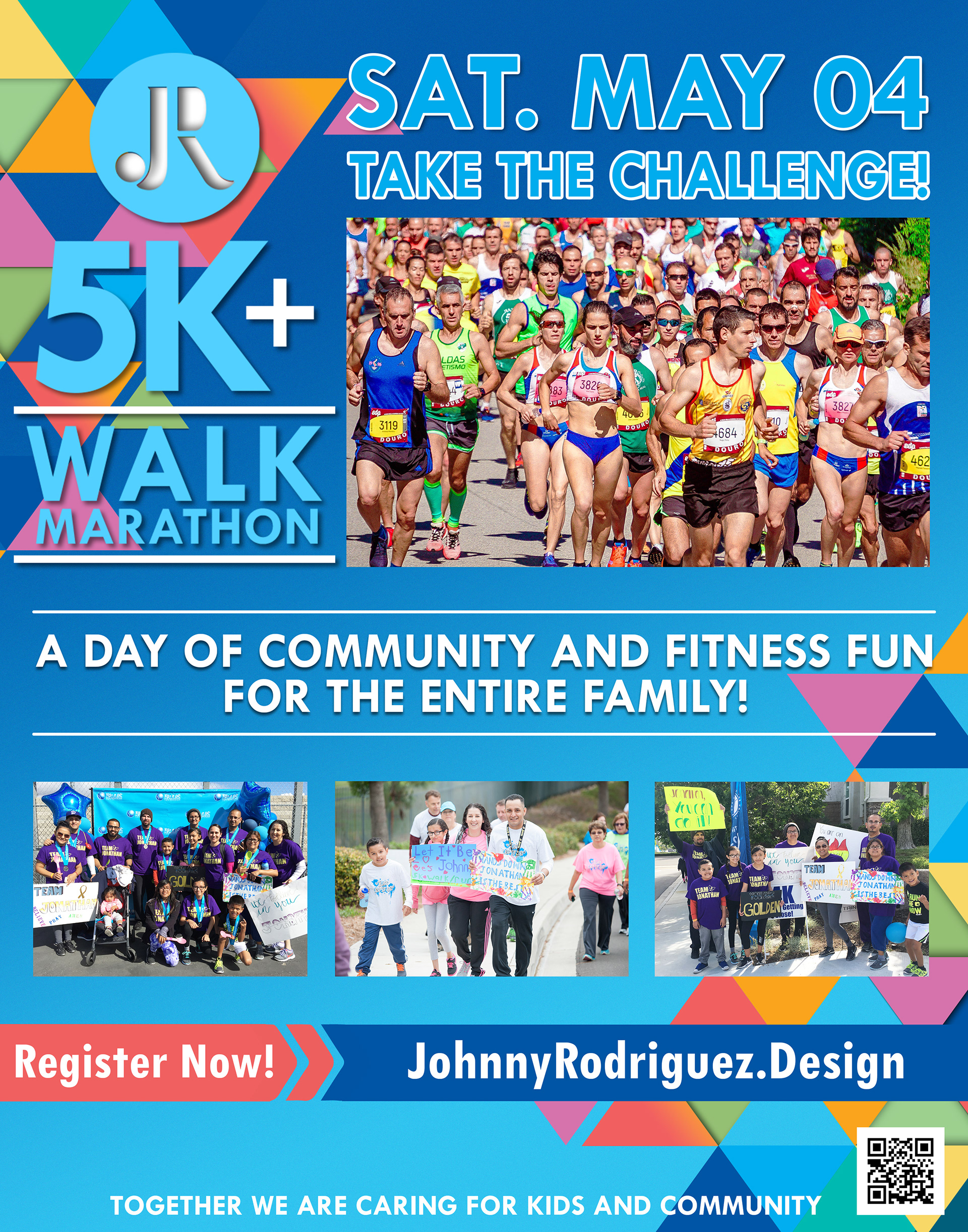
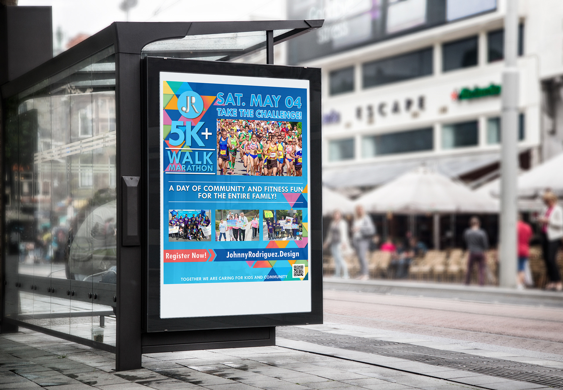
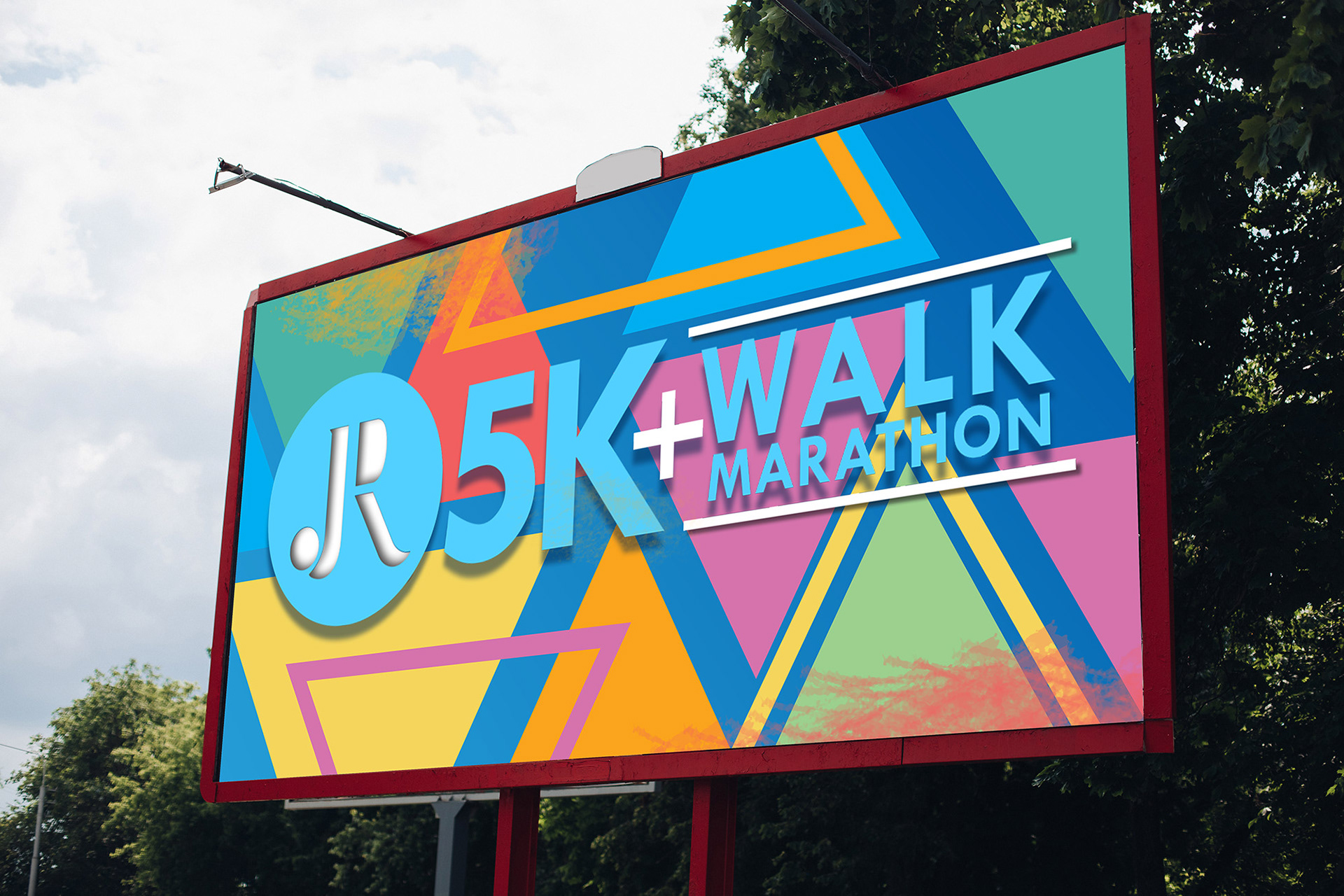
COLLATERAL: The next step was to make complimentary media that advertises the 5K+ Walk Marathon that had the same graphical look as the event's main poster. This collateral consisted of a bus stop billboard, and a postcard
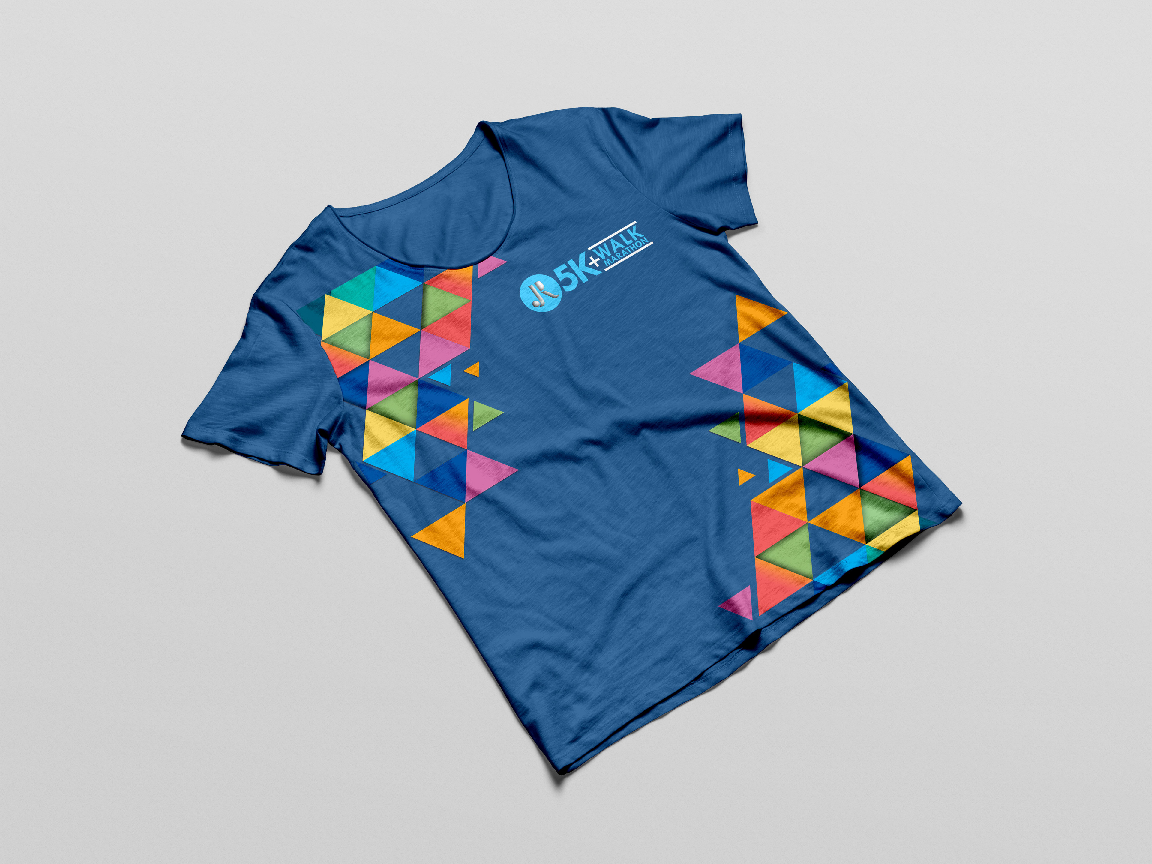
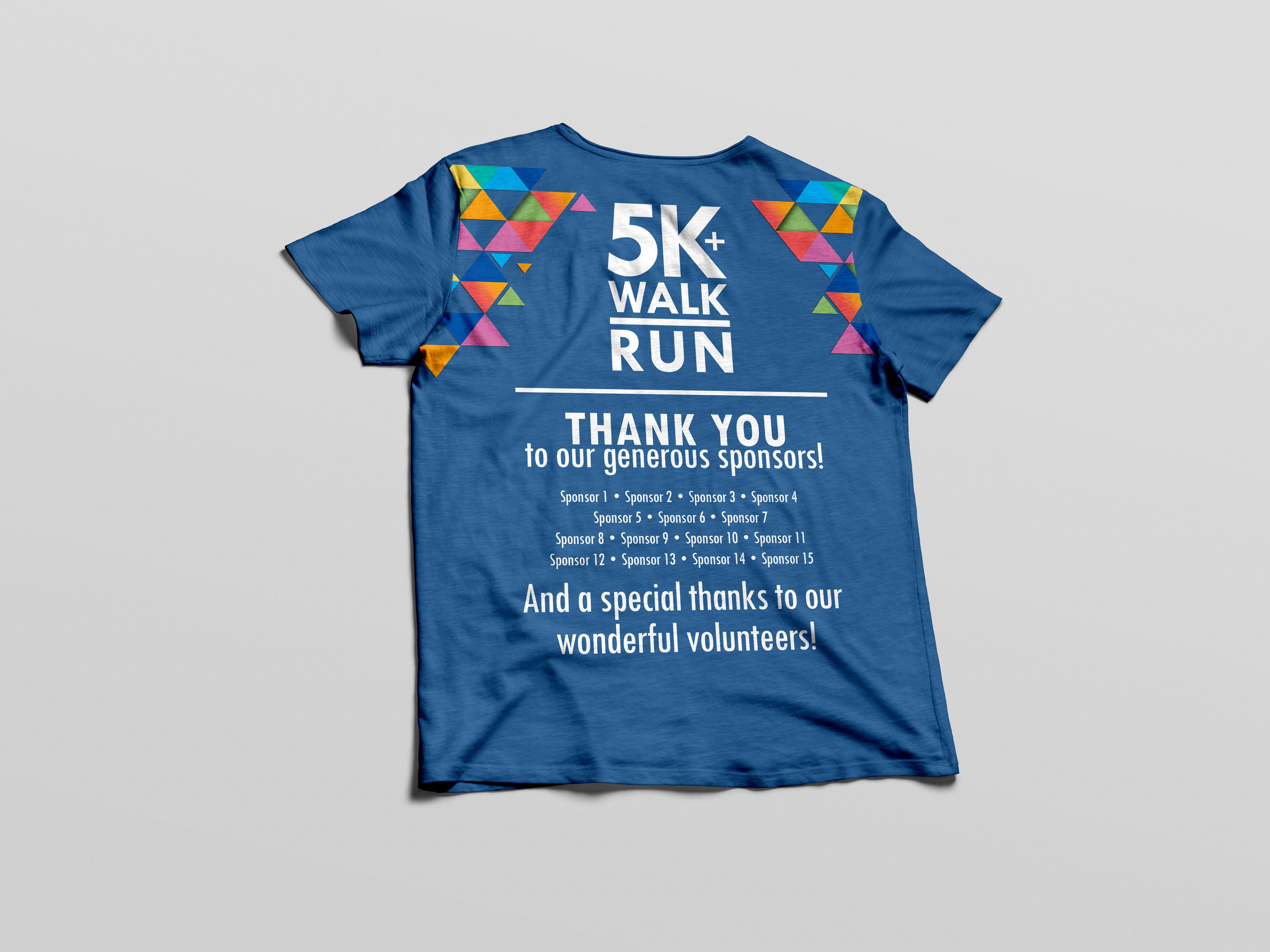
EVENT T-SHIRT
FINISH LINE BANNER

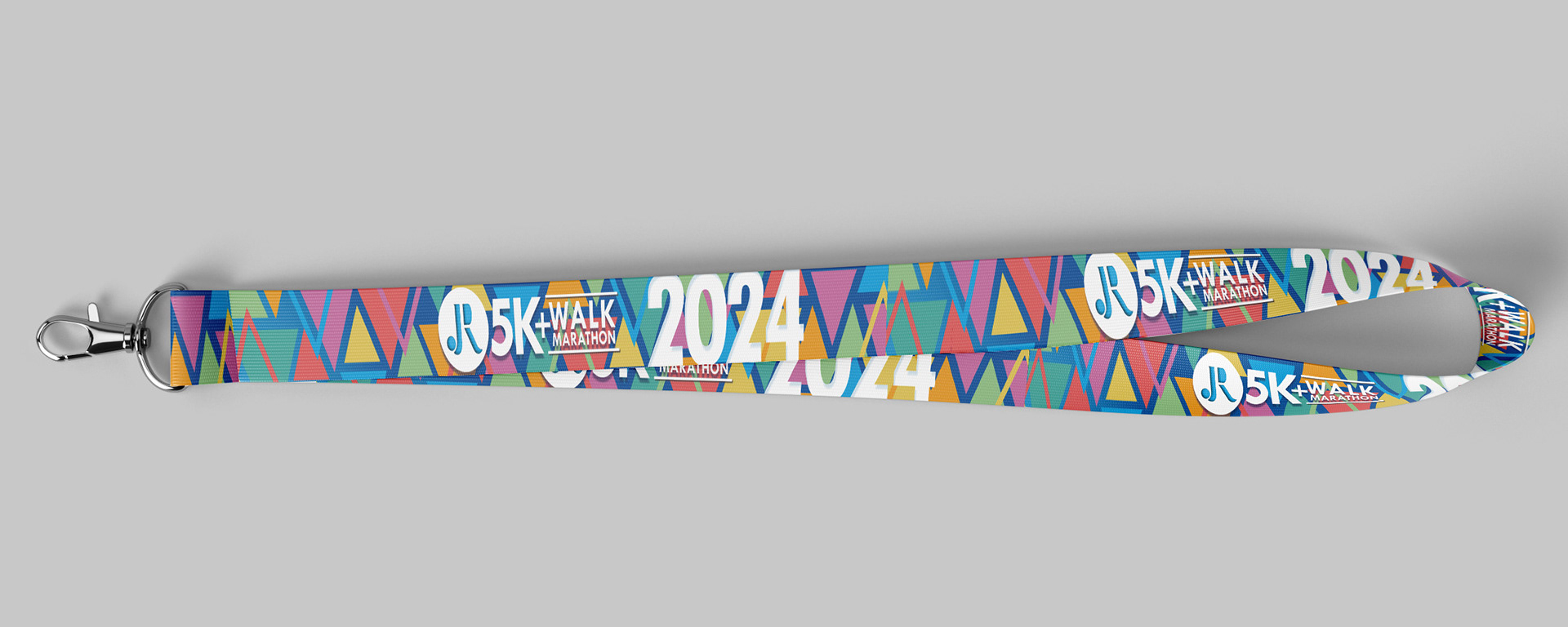
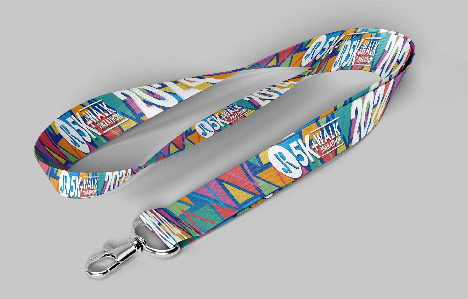
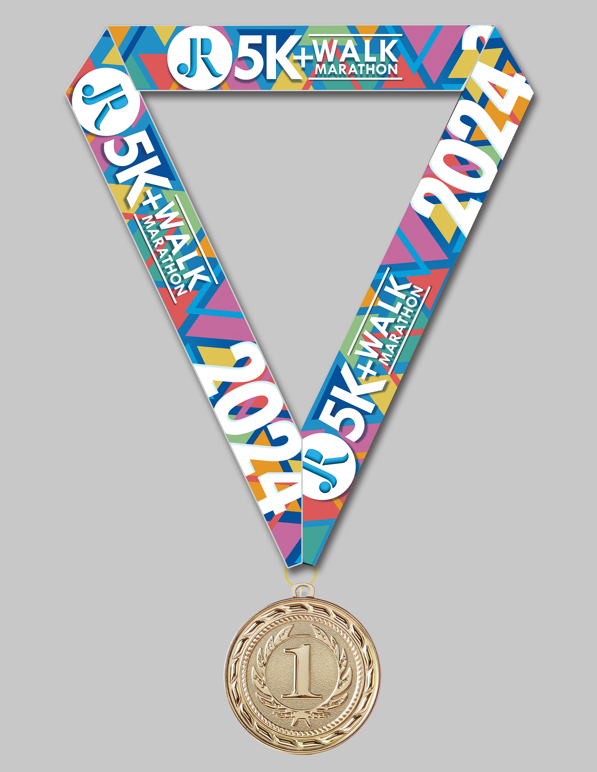
COMPLETION MEDAL: One of the more important visual elements of the event is the lanyard that is given to those who cross the finish line, with the 5K medal hanging off of it. The lanyard has the same geometric pattern as the finish line banner. It includes the event logo as well as the year, so that runners (and walkers) can look at the medal and remember the fun they had on this day.